Yum City
The Challenge
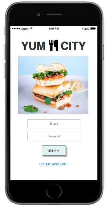
The Yum City user is an urban adult looking to make a quick and easy restaurant reservation. My challenge was to create a clean, intuitive mobile app that would help users swiftly figure out where and when they could grab their next meal.

The Approach
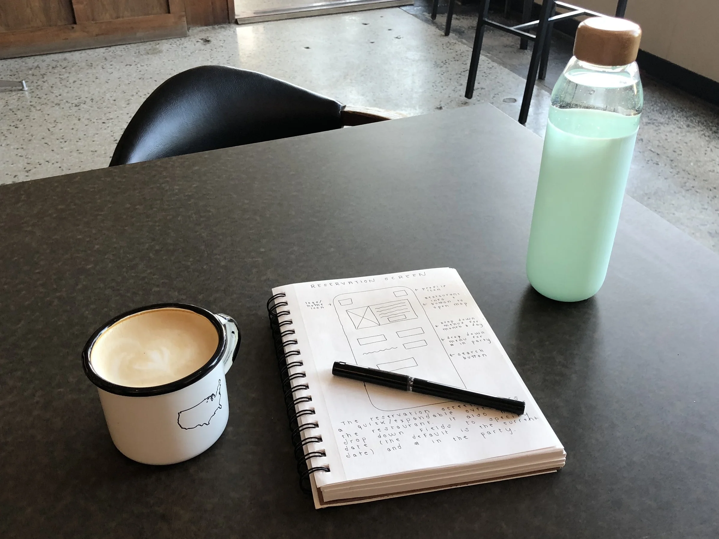
Through directed storytelling, I gained a clearer sense of who the Yum City user was and what they valued. I then created both analog and digital sketches of interfaces and mapped out a user flow before making a clickable prototype.
Insights
After creating a clickable prototype, I conducted usability testing with a small pool of sample users.
What was Tested:
- Users were asked to review the Homepage and describe what they saw and understood from that screen.
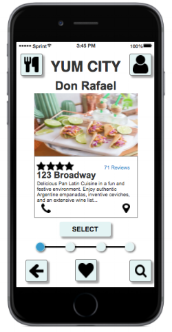
- Users were then invited to make an 8:30pm reservation at one of their favorite restaurants, Don Rafael.
What Was Learned:
- Users were confused when irrelevant buttons or features were present.
- More explicit way-finding text—coupled with a logical progress bar—will help users better understand where they are in the reservation process.
- While the site enabled users to complete the assigned task quickly, the flow of information—particularly about the restaurant—was compressed.
- Users desired a clearer way to input information on the reservation site.
Design solution

During Usability Testing, this reservation screen proved particularly confusing.
Users didn't understand what "Search" meant in this context, since they had already selected their restaurant.
Where they were supposed to specify the month was clear enough to users, but the drop-down menu to the right was ambiguous.
Lastly, users were expecting to see somewhere where they could specify the time they were looking for.
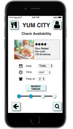
This revised screen clarifies the information that users need to enter and offers them a default setting for diners looking for the quickest available option.
The text of the action button was clarified so that users know that they are searching for available tables at their chosen restaurant.
Additionally, the "Favorite" button was removed from the bottom of the screen, as it served no useful purpose here.
One of the biggest issues with the user flow was that it took users directly from finding a restaurant to booking it, without allowing would-be diners enough time and space to evaluate their options.
To solve this, I created an intermediate restaurant listing page that would allow users to read more text, access restaurant reviews, and view its location.
This screen also became a logical place for users to "favorite" a particular establishment.
Finally, the restaurant listing became a logical new place to introduce the progress bar graphic.