
Accessibility Redesign: Jobscan

the challenge
Jobscan is a young, Seattle-based start-up that began as a tool to help job seekers optimize their resumes for Applicant Tracking Systems (ATS). The company has since expanded to include other services, including LinkedIn optimization and a robust learning center. My challenge was to investigate and propose ways that Jobscan can improve both its UI and UX.
Timeline: One week sprint
My role: Reseacher, Designer, UX Writer, IA
Methods applied
Stakeholder Interview
Heuristic Analysis
Cognitive Walkthrough
Usability Testing
Tools Used
Pen & Paper
Photoshop
Sketch
Keynote
Learning the Landscape
Jobscan was born out of the founder’s frustration with his own job search. Realizing that he’d have to tailor his resume to get past the “resume robots,” James Hu built Jobscan to provide some visibility into the opaque netherworld of Applicant Tracking Systems. Five years later, Jobscan has grown rapidly to include a wide range of services and content. Because of this rapid growth, the site is characterized by its labyrinthine architecture and inconsistent aesthetic.
Jobscan now serves hundreds of thousands of customers with its free version. With paid membership options, users are able to scan an unlimited number of resumes and access more tools.
To expand its impact, Jobscan partners with a variety of educational institutions, career coaches, NGO and government career services. As a result, immigrants, underserved populations, and long-term unemployed people are logging on.

redefining and designing
Jobscan’s current site, with its bright color palette and informal aesthetic, speaks to a younger (and likely more tech-savvy) audience. The company’s expanding influence, however, presents an opportunity to redefine the Jobscan user.

Accessibility. Jobscan’s broadening reach presents an opportunity to improve the site’s accessibility so that older, differently abled, and foreign-born users can benefit from all that Jobscan has to offer.
Aesthetic Consistency. The look and feel of Jobscan should remain consistent across the board, whether users are on the landing page, logged in and reviewing their history, checking out the learning center, reading the blog, or viewing tutorials.
Information Architecture. By taking time to assess and revamp the IA, Jobscan can help users navigate the site in an easy, intuitive way, with information presented in a digestible format.
“It’s overwhelming how much content is available in one place.”
-Usability Tester
Mock-Up and Recommendations
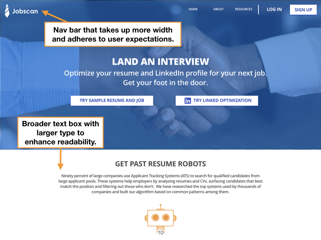
To crystallize some of my recommendations, I redesigned Jobscan’s current landing page, resulting in the following mock-up:
Current Jobscan Landing Page
Redesigned Jobscan Landing Page
Along with my new design, I provided some context for understanding my design decisions.
A few changes I made were:
Higher contrast between the text and the hero image.
Enlarged text in order to enhance legibility.
Assertive copy that speaks more directly to users’ needs and goals.
A hero image with a stronger implied narrative.
A redesigned nav bar that uses more real estate and includes a “Home” button for heightened inclusivity.


Next Steps
Jobscan’s site is ripe with design opportunity. In addition to testing my own proposed design, my next steps would be to dive into the site’s tangled information architecture and create a design pattern library for its sprawling content.