
Service Design: I Did It Skyway

The Challenge
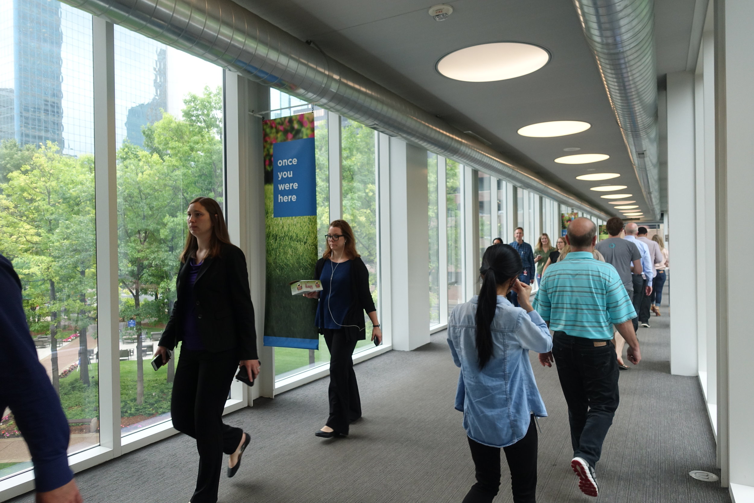
The Minneapolis Skyway system is an intricate web of walkways that connect many of the major buildings in the downtown area. The first portion of the skyway was built in 1962; it has continued to grow organically since then. Each portion of the skyway is "owned" by the adjacent buildings, so there is no single entity responsible for the entire skyway. Because of this shared ownership, there is a lack of coherence throughout the system, which poses a host of wayfinding challenges, especially for first-time users.
Timeline: Two week sprint
My Role: Researcher and Designer
Methods Applied
Contextual Inquiry
Comparative Analysis
Custom Method (including Photo Diary)
Personae
Feature Cards & Kano Analysis
Tools Used
Pen & Paper
Camera
Sketch
Photoshop
Adobe Illustrator
ADVENTURES IN WAYFINDING
During the discovery phase of my research, I used a custom method to learn about users' experience navigating an unfamiliar route via the skyway.
Participants were given kits containing a Caribou Coffee card, a survey, and a set of instructions, asking them to download a skyway navigation app.
Their mission was to walk from the Grain Exchange Building to the Caribou Coffee in the Baker Center using the skyway and the navigation tools available to them.
Along the way, participants documented the tools that helped them, the places where they felt unsure of where they were, and how they felt throughout the process.


KEY FINDINGS
Participants reported a range of sentiments about their skyway experience. The most frequently used descriptor, however was "confusing."
My research revealed several key pain points:
Illegibility - The maps and signs were accurate but often hard to decipher.
Lack of Confirmation - Users were often unsure whether they were on the right path or even within the skyway system.
Inconsistency - There is a lack of uniformity in the signage and the maps are not always placed at predictable intervals.

UnDERSTANDING THE USERS
From my research, two main personae emerged: the experienced user (Savvy Skyler) and the occasional user (Novice Norbert). We see in these two personae a sizable gap in the quality of their experience—Savvy Skyler reports much more satisfaction and confidence in using the skyway than Novice Norbert. This differential suggests that while the skyway is not currently intuitive, it is learnable.
Design solution
After following up with research participants to identity a few desired features, I developed a three-pronged approach that aims the improve legibility, provide feedback, and create continuity.
A simplified, color-coded map that orients around four key landmarks:

Consistent, legible signage that references main landmarks:
BEFORE:

AFTER:

And an app that draws from the same visual vocabulary as the map, tracks a pedestrian's progress, and notifies users when they stray off course:


In retrospect
I would have dug in more to the pain points experienced by the different personas before proposing the various design solutions that I did. (From a purely visual standpoint, I would also reorient the individualized maps so that it points users “forward,” to the top of the screen.) After synthesizing my findings into a design, I would test its efficacy with a similar wayfinding challenge.